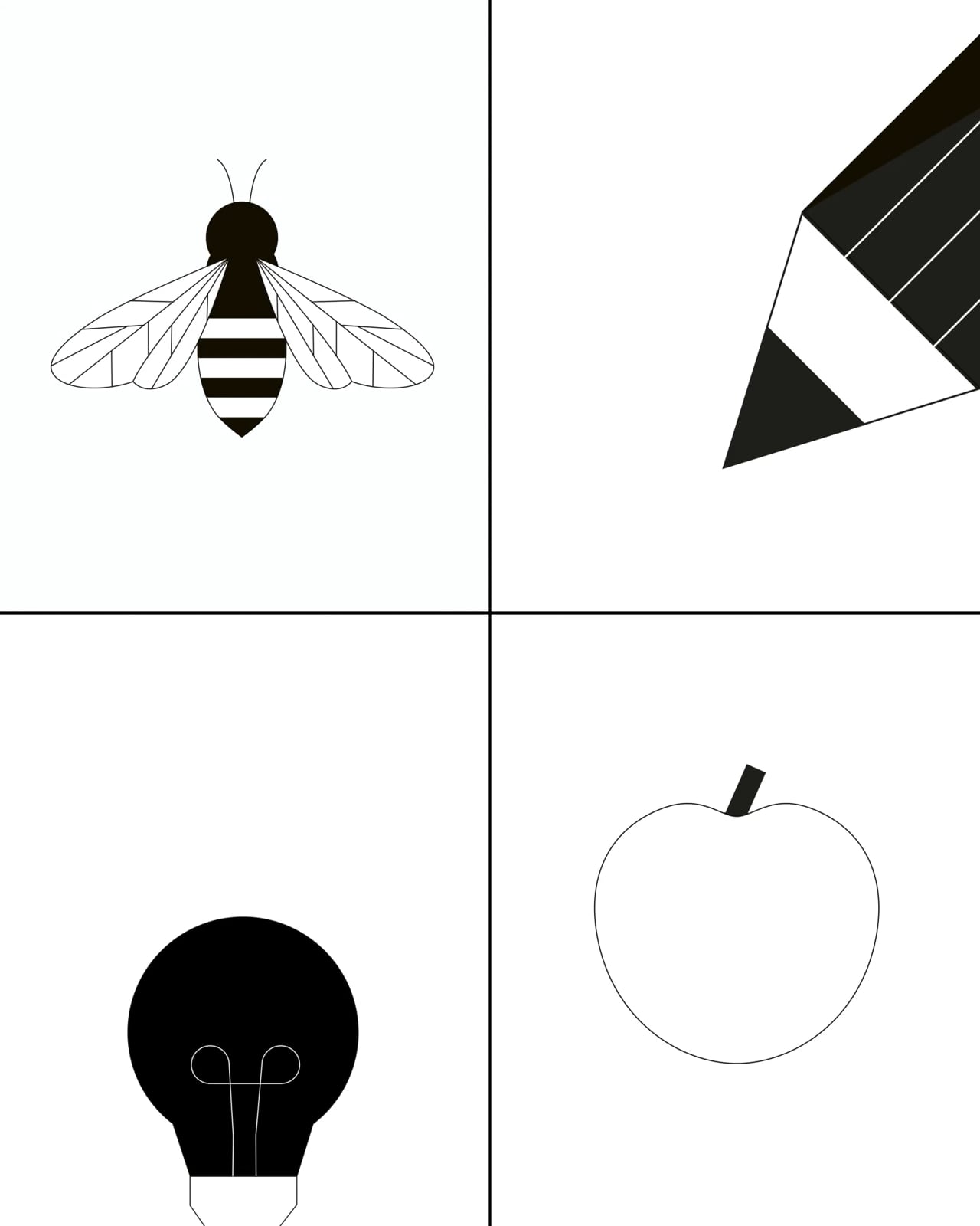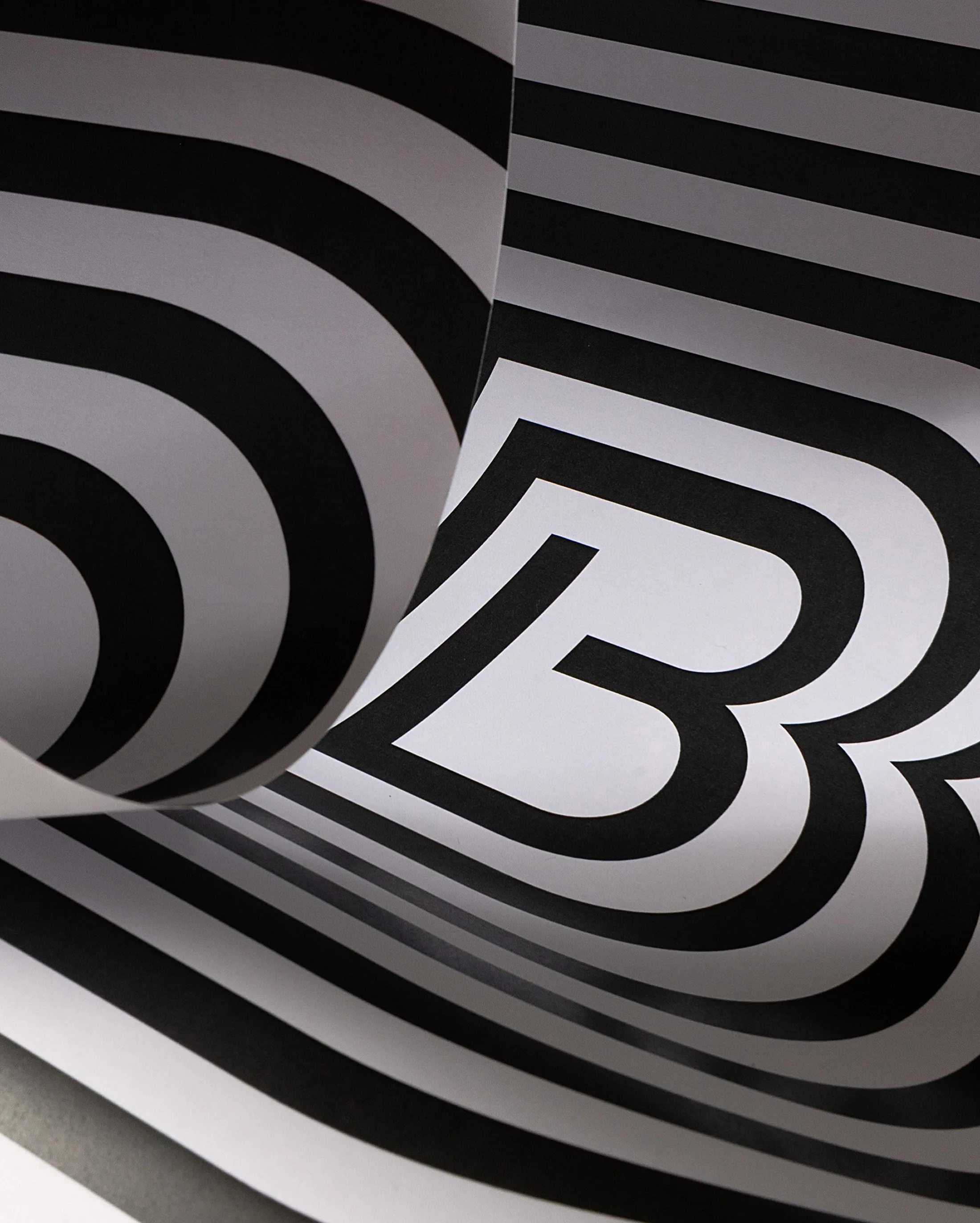
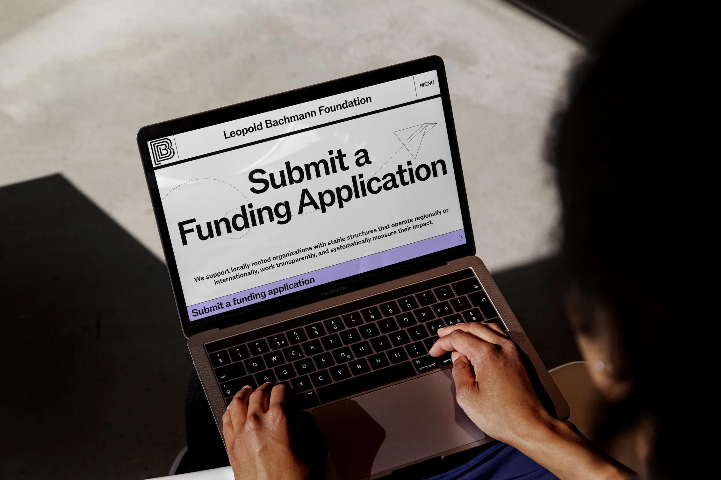
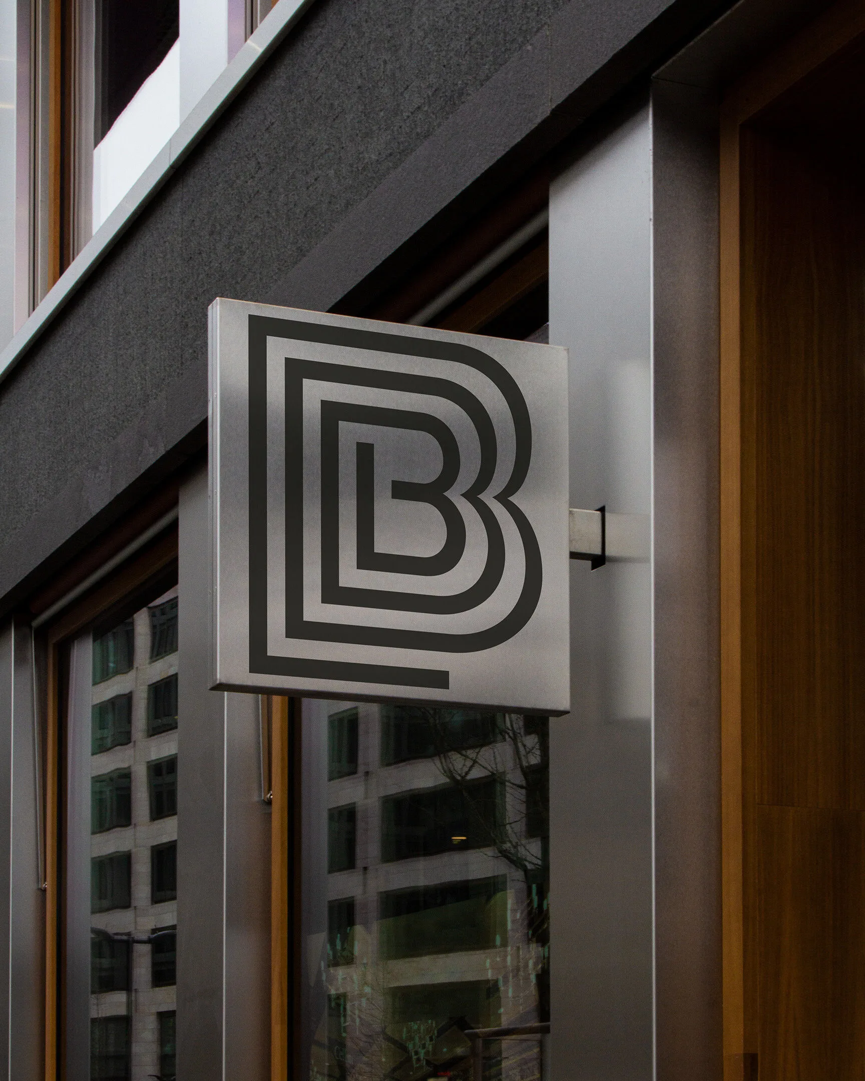
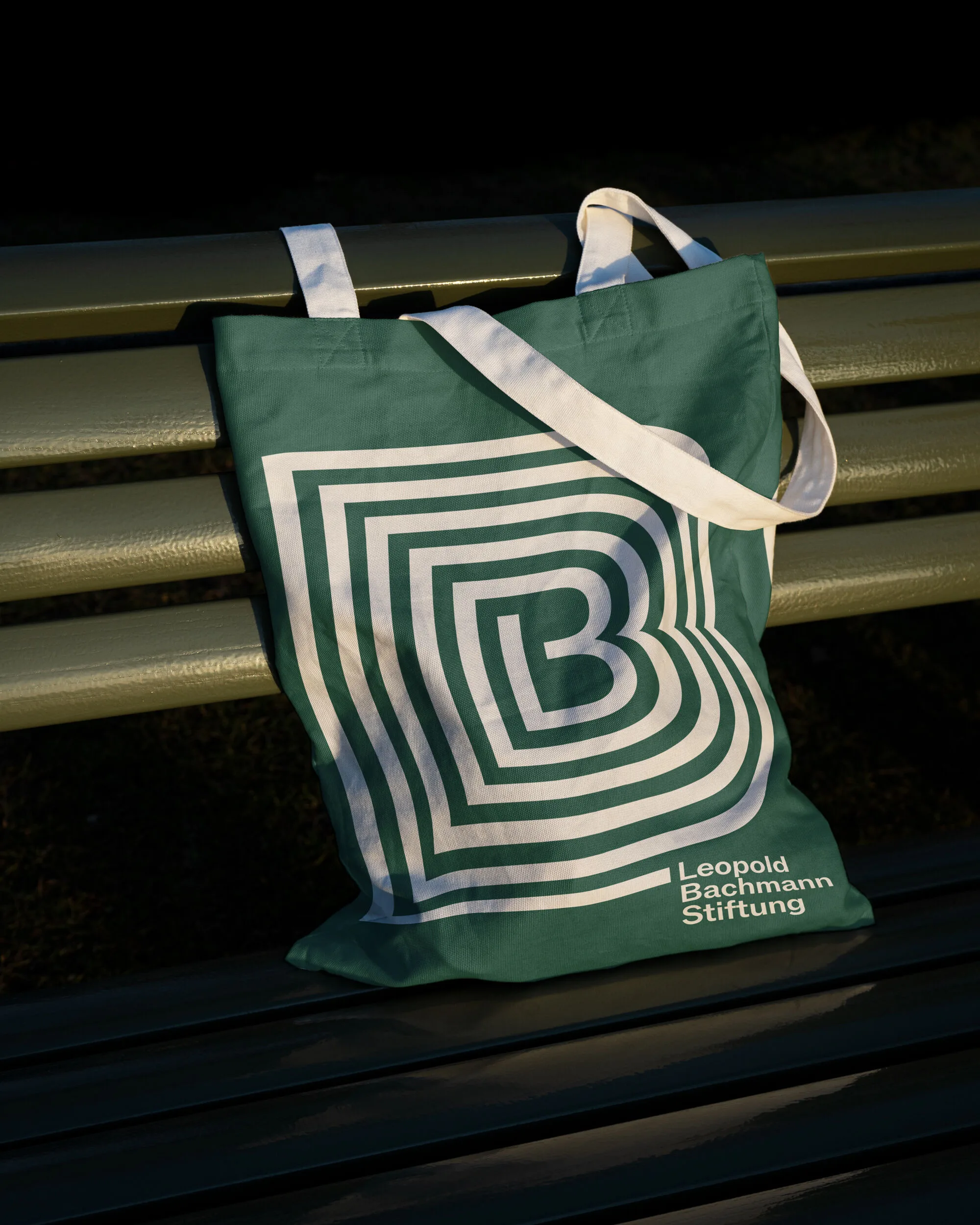
Project made at Raffinerie. The foundation's new visual identity puts its core idea at the centre: supporting people and organisations as they develop and grow. The initials LB form a logo that can grow. A line emerges from it and becomes the defining element of the entire corporate design: it structures the layouts, connects content and forms the basis for a custom illustration world. The visual system is complemented by an imagery style defined through moodboards, which local photographers can carry out in different locations. The result is a flexible identity that brings together the foundation's diverse work and consistently carries forward its idea of growth.